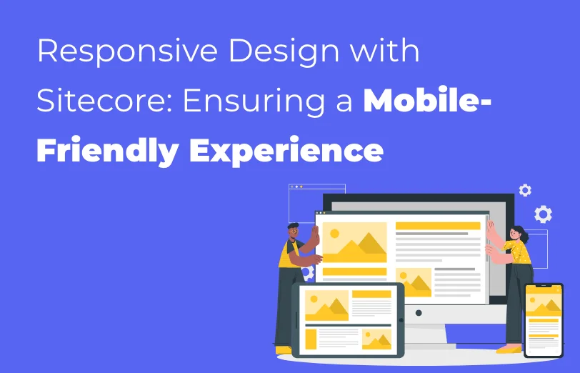
In today’s digital landscape that is constantly changing and evolving, responsive design has
grown to become an important aspect. With an increasing number of users accessing websites on
various devices such as smartphones, tablets, and desktops, it has become imperative for
businesses to prioritize mobile friendliness.
Through this article, we will explore how Sitecore, one of the world’s leading CMS and digital
experience platforms, offers to ensure a seamless and responsive design across devices with its
powerful tools and features.
What is Responsive Design?
It is the approach towards web design that aims to create a flexible and adaptable user
interface, ensuring optimal viewing and interaction experience for multiple devices.
Rather than creating separate designs for different devices, responsive design utilizes a single
codebase that automatically adjusts the layout, content, and functionality based on the screen
size and device capabilities.
Responsive design, as an approach to web development, is not merely a trend but a strategic
imperative. With users accessing websites from a myriad of devices with varying screen sizes and
resolutions, the ability to dynamically adapt content and layouts has become synonymous with
delivering a superior user experience.
The rapid growth of mobile devices has transformed user behavior, making it crucial for
businesses to invest in responsive design. Here, Sitecore provides a comprehensive solution for
creating and managing responsive websites.
Sitecore's toolkit equips businesses to not only meet but exceed the expectations of a tech-savvy
and ever-connected audience.
Key Components of Sitecore for Responsive Design
-
Device detection and profiles
Sitecore incorporates device detection capabilities that allow websites to identify the
type of device accessing the content. This information is used to dynamically adjust the
layout and content for an optimal user experience.
Additionally, Sitecore enables the creation of device profiles, allowing marketers and
developers to customize content and interactions based on specific device
characteristics.
-
Flexible layouts with device channels
Sitecore's device channels provide a mechanism to define different layouts for various
devices. Developers can create specific layouts tailored to the screen size, resolution,
and capabilities of devices. This flexibility ensures that users receive a visually
appealing and user-friendly experience regardless of the device they are using.
-
Media library for adaptive images
Sitecore’s media library offers features that help you optimize the images for responsive
design.
By incorporating adaptive image techniques, Sitecore ensures that images are delivered in
the appropriate size and resolution based on the user's device. This not only improves
page load times but also enhances the overall user experience.
-
Personalization capabilities
Sitecore is known for brilliant personalization capabilities. It extends to responsive
design, allowing marketers to deliver targeted content based on user behavior,
preferences, and device type.
By tailoring content for specific devices, businesses can maximize engagement and
conversions across different channels.
-
Mobile preview and testing
For developers and marketers, Sitecore provides tools for previewing and testing the
responsiveness of the websites across various devices.
The Mobile Preview feature allows users to see how content will appear on different
screens, facilitating adjustments and optimizations before deployment. This ensures a
seamless user experience across the entire spectrum of devices.
What are some of the best practices for Responsive
Design with Sitecore?
-
Start with a mobile first approach as it ensures that the website is optimized for
smaller screens and progressively enhances the layout for larger devices. Using
Sitecore, you can enable the creation of device-specific layouts and ensure a smooth
transition from mobile to desktop experiences.
-
Utilize fluid grids and flexible images which are the key elements in creating a
responsive layout.
-
Optimize performance for mobile such as content caching, image compression, and lazy
loading. These practices contribute to faster page load times, enhancing the user
experience on mobile devices.
Conclusion
In conclusion, as the digital landscape continues to evolve, businesses must prioritize
responsive design to cater to the ever-growing mobile audience.
Sitecore stands out as a reliable ally in this endeavor, providing the tools and features
necessary to create a cohesive, visually appealing, and user-friendly experience across a
spectrum of devices.
Embracing responsive design with Sitecore is not just about meeting current standards; it is a
forward-looking strategy that ensures adaptability and relevance in the face of constantly
evolving user behaviors and technological advancements.
By putting responsive design at the forefront of digital initiatives, businesses can build
lasting connections with their audience and stay ahead in the competitive online environment.
 BACK TO
SERVICE LISTSitecore Module Development Add new features, extend new features, or even replace, supplement and provide new functionality to Sitecore. Sitecore CMP & MRM Through the Sitecore CMP & MRM, drive execution, workflow, operations and processes of your entire marketing team. Sitecore Ordercloud Create a dynamic eCommerce platform and future-proof your business for B2B, B2C, B2X or any other marketplace business model. Sitecore Discover Provide real-time, personalized search results and recommendations for every individual shopper, all in one place.
BACK TO
SERVICE LISTSitecore Module Development Add new features, extend new features, or even replace, supplement and provide new functionality to Sitecore. Sitecore CMP & MRM Through the Sitecore CMP & MRM, drive execution, workflow, operations and processes of your entire marketing team. Sitecore Ordercloud Create a dynamic eCommerce platform and future-proof your business for B2B, B2C, B2X or any other marketplace business model. Sitecore Discover Provide real-time, personalized search results and recommendations for every individual shopper, all in one place.


 Sitecore Development Services
 Sitecore Maintenance & Support
 Sitecore Digital Marketing
 Sitecore Consulting Services
 Sitecore Platform
Integration Service
Sitecore Platform
Integration Service Sitecore Platform Upgrade
Service
Sitecore Platform Upgrade
Service Sitecore Audit Service
 B2B Partnership
 Hire Sitecore Team
 Blogs
Blogs
 Events
 Webinars
 Videos
 Case
studies
Case
studies